
Most startup branding problems are not creative problems. They are decision problems, made early, in a hurry, usually to save money that they end up spending three times over. After six years of building identities for startups and companies across the US, Europe and the Gulf, these are the ten mistakes I see most, and what to do instead.
1. Buying a logo instead of an identity
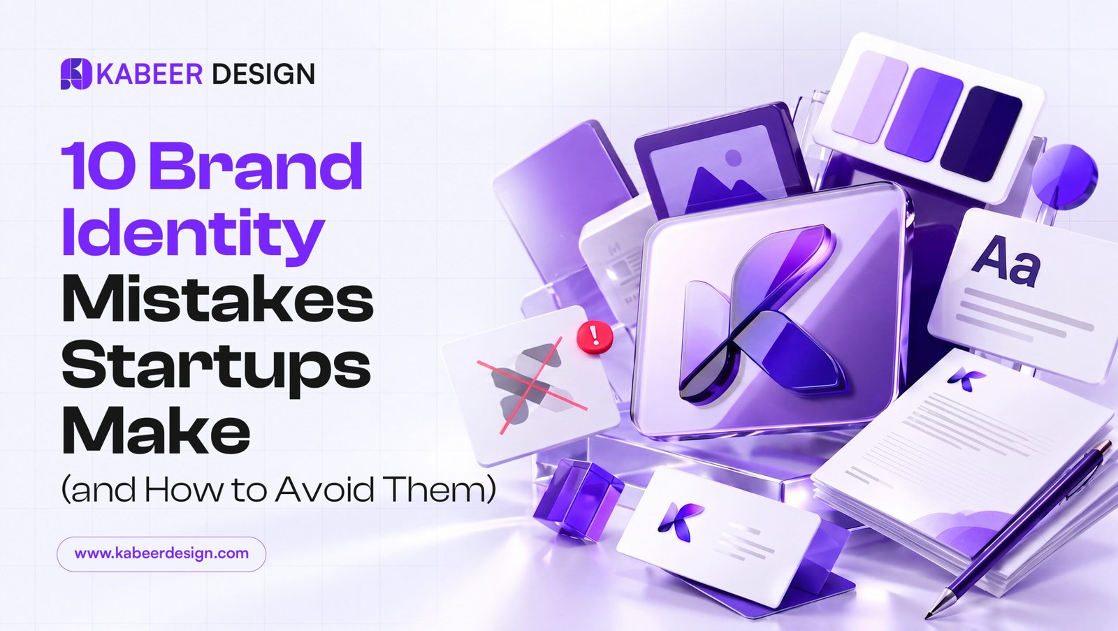
A logo is one mark. An identity is the system around it: color, type, spacing, image style, templates. Startups that buy only a logo end up with a nice mark floating over inconsistent everything. The fix: even a small identity package with basic guidelines beats an expensive logo alone.
2. Designing for the founder’s taste, not the customer’s
Your brand is not your favorite color. It is the shortest path to your customer trusting you. Every design decision should answer one question: what does the person paying us need to feel?
3. Following trends that expire
Gradient blobs, ultra-thin type, whatever is on Dribbble this quarter. Trendy identities look dated in eighteen months, and a rebrand costs far more than doing it right once. Aim for a mark that would have worked ten years ago and will work ten years from now.
4. Skipping the one-color test
If your logo dies in single color, it will fail on invoices, embroidery, laser engraving and fax-quality print. Every mark I deliver has to survive pure black on white first. Color is a layer, never a crutch.
5. No real brand guidelines
Without guidelines, every freelancer, printer and intern reinvents your brand. A short PDF covering logo usage, colors, type and spacing keeps the brand consistent long after the designer leaves the project.
6. Ignoring how the brand moves
Your identity will live on Instagram, in ads and in product UI, all of which move. A simple logo animation and motion rules make a startup look twice its size on launch day.
7. Cheap type decisions
Typography carries more of your brand than the logo does, because customers see far more paragraphs than logos. License good typefaces and define a clear hierarchy. It is the highest-leverage money in branding.
8. Twenty revisions with no strategy
Endless revisions almost always mean the strategy conversation never happened. Agree on positioning, audience and personality first; then design reviews become quick decisions instead of taste debates.
9. Forgetting real-world surfaces
Business cards, packaging, signage, merch: physical surfaces have bleed, minimum sizes and material limits. An identity designed only for screens breaks the first time it meets a printer.
10. Treating branding as a one-time event
A brand launch is the start, not the finish. Budget for ongoing design: campaigns, decks, social kits. Consistency compounds; that is the entire trick.
If you recognize your startup in more than three of these, the fix is cheaper than you think, and much cheaper than a rebrand later.
Need this done for your brand?
Logos, brand identity, motion and video for startups and brands worldwide. Clear prices, replies within 24 hours.
See services & prices →